Dashboards just might be the most useful tool you have at your disposal.
The problem is they usually visualize, collect, and connect to too few things. Data is siloed or stuck in spreadsheets, important processes are stuck in tools that not everyone has access to, and none of these systems talk to each other. A truly connected, unifying dashboard is the solution to a lot of the pains this causes.
Dashboards help you visualize your data in a more humanistic way, so you can more easily see trends, identify problems, and make data-driven decisions. Dashboards give you a sharable interface you can use to communicate important information to stakeholders without giving them access to an entire database. They can help you report to leadership or show your team the big picture of the work they’re contributing to.
It's hard to find a dashboard that does everything you need it to, and creating an effective dashboard the traditional way requires a lot of code and tooling expertise — or a lot of time and money to get it done by someone else.
Luckily, with no code, you have the ability to build your own hyper-connected, customized dashboards without having to know how to code them.
Let’s look at how to use dashboards effectively at work and how to build your own using a no code platform.
What’s a no code dashboard builder?
No code and low code tools, in this case, a no code dashboard builder, enable people without any coding skills to create software.
Typically, creators interact with no code platforms through easy-to-use, drag-and-drop user interfaces. Platforms can streamline the process of building with pre-fabricated components or give you the ability to add workflows like automation or AI functions. No code tools also offer easy integrations with other software and data sources to give your final product more functionality and power.
The types of creators who participate in no-code app development have come to be known as citizen developers — people with a passion for building tech who don’t have the typical background or experience required to build tech in a traditional way.
And one of the most popular kinds of software that citizen developers can create via no code tools is, of course, the dashboard.
The dashboards you create with this guide will be web applications. These are interactive, gated web apps that use adaptive design to adjust to any device. This means your team can access the same app from their smartphone, tablet, or computer and get access to the same views, workflows, and data.
The best uses for custom no code dashboards
A dashboard is a platform for visualizing data — like the dashboard in your vehicle.
Business dashboards bring important metrics or processes together in a single place, creating a single command center for workers (operational) or a digestible overview for executives (strategic).
Dashboards can help with a nearly endless number of use cases at work.
They can be as large and powerful or as specific and limited as they need to be. A business intelligence dashboard can be a powerful driver of a company’s success, or a simple KPI dashboard can help your team keep track of progress on a key revenue-generating project. A budget dashboard can help you track expenses for a single project.
The benefits remain the same. Better data insights and better data visualization. Which leads to better decision-making since you are able to make data-informed decisions. Your team stays on the same page and gets equal access to vital information for projects they’re working on. A dashboard can empower your employees to work autonomously and really enjoy ownership over their roles. It can help you save money and discover new opportunities.
How to create a no code dashboard for your business with Glide
As we touched on earlier, building custom dashboards used to be quite a feat — requiring professional software developers, trained designers, and a pocket full of cash, with the average traditional app building cost being over $100K.
But with the rise of no code software development, you have the power to create business dashboards that are perfectly tailored to your unique business needs, more efficiently and cost-effectively than ever before.
We’ll walk you through this process using Glide. While there are many drag-and-drop app builders out there now, Glide is especially suited to building dashboards. As a platform focused on building professional-grade apps for work, Glide app builds start with your data. You can connect whatever existing business data sources you already have, from Google Docs to MySQL, and your dashboard’s format will adapt to that data.
Here’s your step-by-step guide to how.
1. Start from scratch or use a template
If you are the kind of person who likes to start building from a blank slate, simply sign up for a free trial and use the tutorials on Glide University to start finding your way around. If you like to start with a structure that you can customize, there is a wide range of templates that will give you a head start on creating your dashboard app.
Here are a few of the most popular dashboard templates:
2. Identify and Organize Your Data Sources
The next important decision to make is: What information does your dashboard need to expose and track? If you aren’t sure, now is the time to identify your end user. Who in your company will be using this tool the most? What should it do for them to make their day easier? You may even want to sit down with these people to make sure you’re really nailing the data that goes into your dash.
With that data in mind, it’s time to combine everything and clean it up.
Collect your existing data sources. You can use data sources like Google Sheets, Airtable, Excel, or SQL databases.
Follow this Introduction to Layout tutorial to organize your backend data in a way that will make your app performant and effective.
If you’re starting from scratch and don’t have any spreadsheets or databases to integrate, that’s also fine. You can work with Glide Tables or Big Tables and the built-in Data Editor to add and work with your data just like you would with any other spreadsheet program.
3. Customize your user experience and data visualizations
Use the drag-and-drop editor to add, remove, rearrange, and customize pages, features, and other components to create your ideal dashboard. You have a lot of options for how you want your data displayed. You can use charts and graphs for visualizations. You can create galleries, for example, if you want to see all of your products visually. You can also use more traditional spreadsheet-like graphs.
From the Layout Editor, you can also give users ways to interact with your data. If users with different roles will be on your dashboard, they might need to filter by different views. To move a project along a pipeline, you can let users change the status of different tracked tasks.
They can even add data with a form, and your original data sources will be automatically updated. In the Glide Data Editor, changes made will sync with the original data source in real time and vice versa, ensuring you have a single, accurate source of truth for business data.
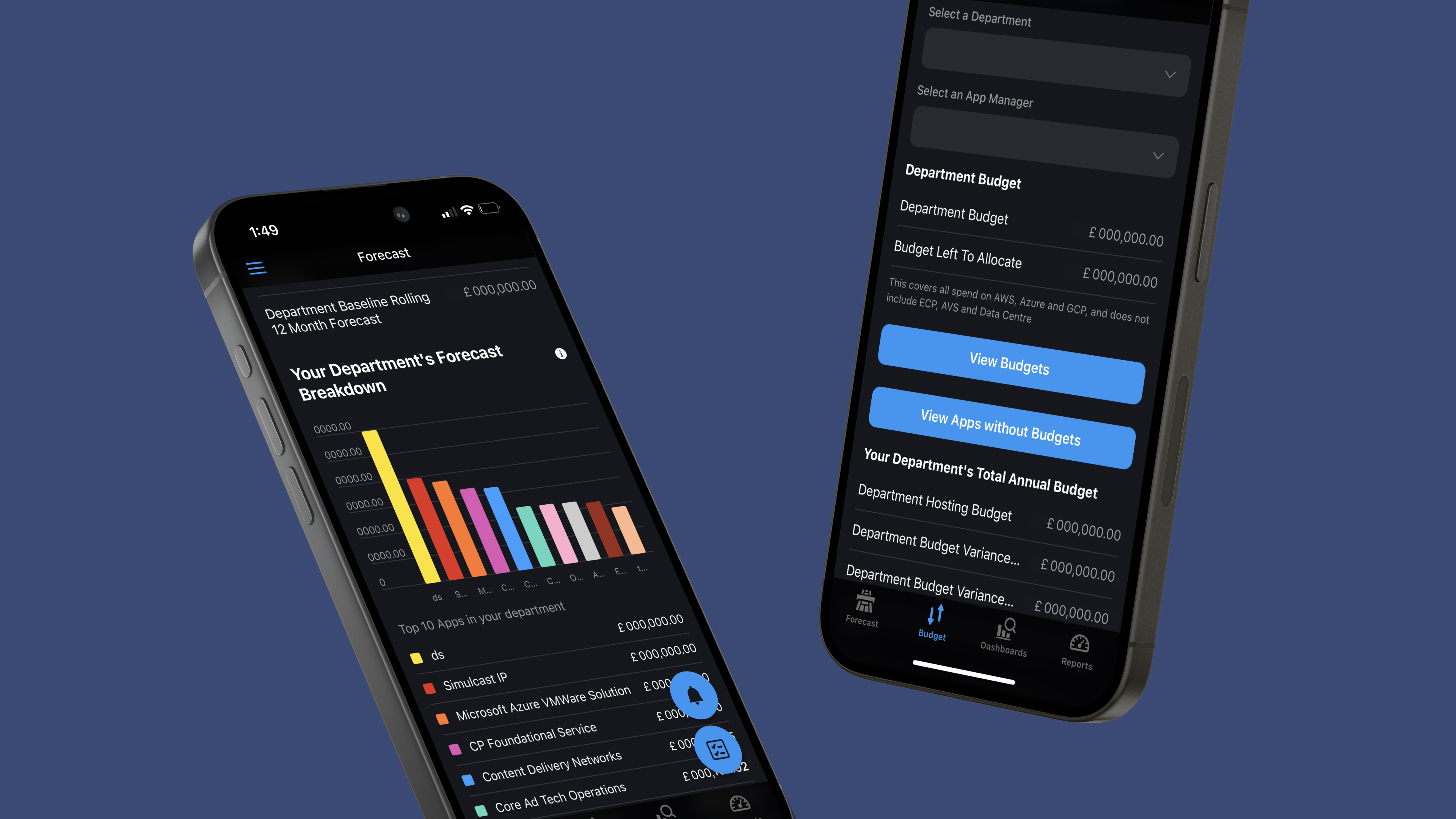
ITV used this feature cleverly to help over 40 different teams track cloud spending across their entire portfolio. Bar graphs allow each team lead to quickly identify overages and see where they are originating.
“I try to make the interface as clean as possible for when you first log in. It’s completely organized for getting the most relevant data to you quickly without any clicking and searching. But if you do want to look at other data in the tool, you can just go into the menu.” - Marc Walford, Head of FinOps at ITV
4. Add integrations and workflows
Next, connect your app to all the other software you need to use at work with integrations. You can pull data from different sources to create one unified interface. You can also integrate communication tools or software that gives your dashboard more utility.
You can integrate with Slack or Gmail to send automated notifications when certain events occur in your dashboard or integrate with a tool like DocsAutomator to generate reports in PDF form from your dashboard. If there isn’t an existing native integration for what you want to do, you can create your own using an application programming interface (API).
Next comes workflows. These let your users trigger actions from your app. Actions can be as simple as buttons the user can click or as complex as giving your users AI-powered workflows right in the app. AI can parse, summarize, and draw conclusions from large datasets extremely quickly, making it a perfect addition to a complex dashboard.
You can also use an integration like Make or Zapier to add automation to your app and trigger actions based on time or other non-manual events in your dashboard.
6. Launch Your App
Finally, in the settings tab, you can update your app name and icon, customize your app’s appearance, control privacy, and set user access with visibility conditions.
Now it’s ready to publish. Customize your link, hit the Publish button, and then follow the prompts to share your app, update your privacy and auto-publishing settings, and more.
Need it faster? Connect with a Glide Expert
Here’s the thing, as easy as Glide is to use, not everyone has the time or the desire to create software for their business.
If that sounds familiar, you can hire an Expert to help you get a finished product much more efficiently than would have been possible with traditional coding.
Glide Experts are individuals and Agencies who are skilled in Glide. Some agencies specialize in a broader range of no code tools and will be able to help integrate your dashboard with your website or your other business tools. They’re also skilled at adding advanced features like APIs, workflow automation, and AI-powered capabilities.
And even with the added support, you still won’t have to shell out nearly as much as traditional software development costs.
One of our agency Experts who do this for a living estimated that Glide app development still costs only one-tenth as much as traditional app development.
Examples of no code dashboards at work
If you want to start from a template, these are some of the most popular dashboards from our template store, with powerful features and visualizations built-in.
Sales Performance Dashboard
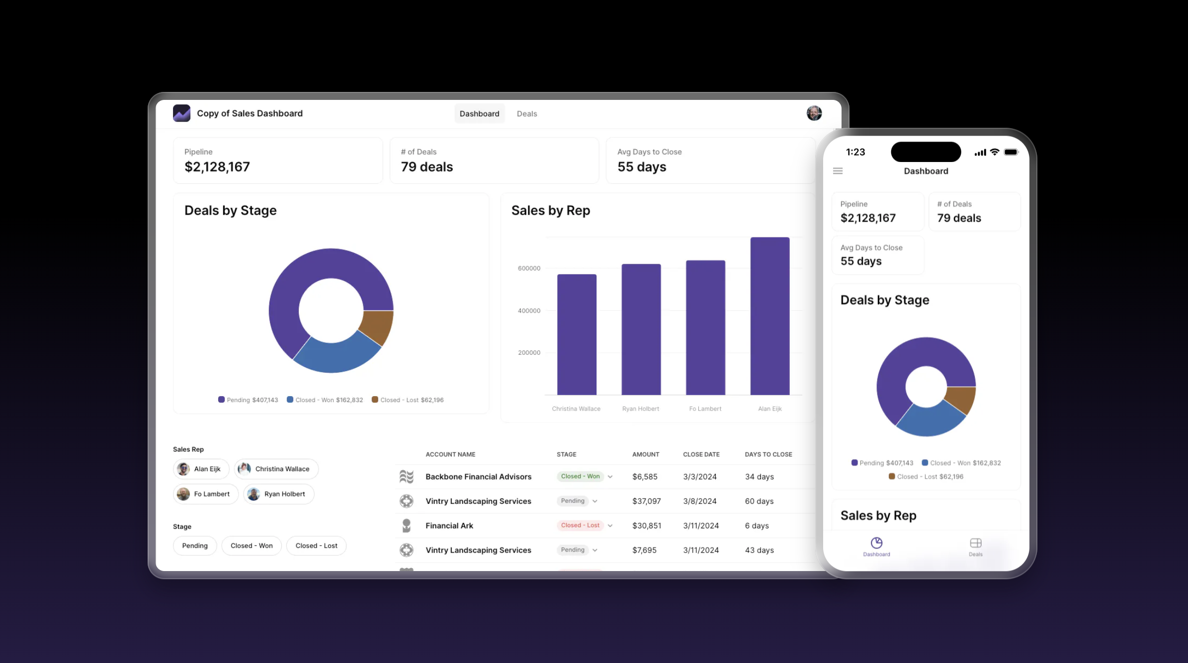
This Sales Dashboard helps your team track and manage sales activities easily. Use it to monitor key metrics, oversee pipeline stages, and evaluate your team's performance. It features:
Interactive Charts: Users can explore various sales metrics to observe performance trends.
Customizable Date Range: Choose specific start and end dates so your users can focus on sales data relevant to their specific analysis period.
Comprehensive Deal Data: See an extensive table containing details on each deal, such as account names, deal amounts, pipeline stages, close dates, and days to close.
Operations Dashboard
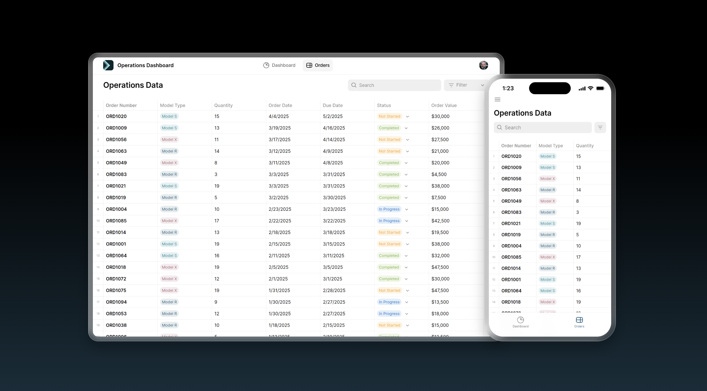
Optimize your business operations with this Operations Dashboard, designed to help optimize your business's order management and operational processes. Use it to track order statuses, manage inventory levels, and ensure timely deliveries, enhancing overall efficiency.
Finance Dashboard
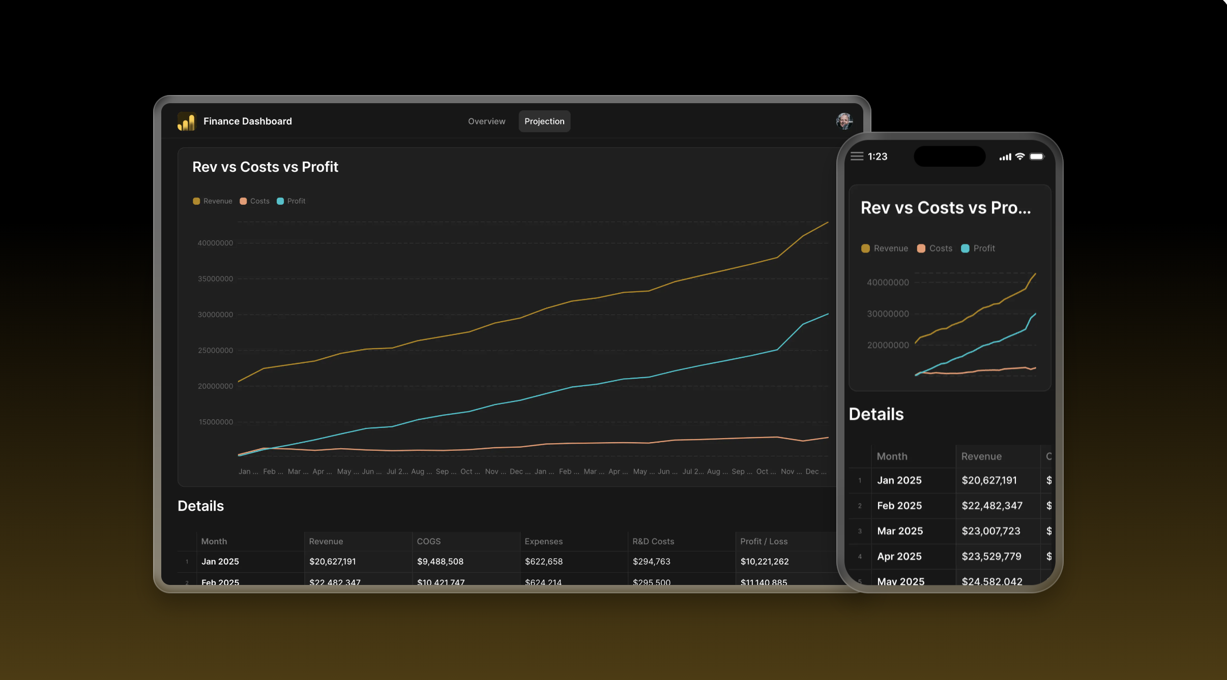
Give your team a comprehensive overview of your financial health with the Financial Dashboard template. Easily track revenue, costs, and profits to make informed decisions and plan for future growth.
This template features an overview tab with a snapshot of your financial performance featuring interactive charts for profit, revenue, and costs. It also has projections, where you can focus on forecasting future financial performance with detailed charts and tables for projected trends in revenue, costs, and profit.
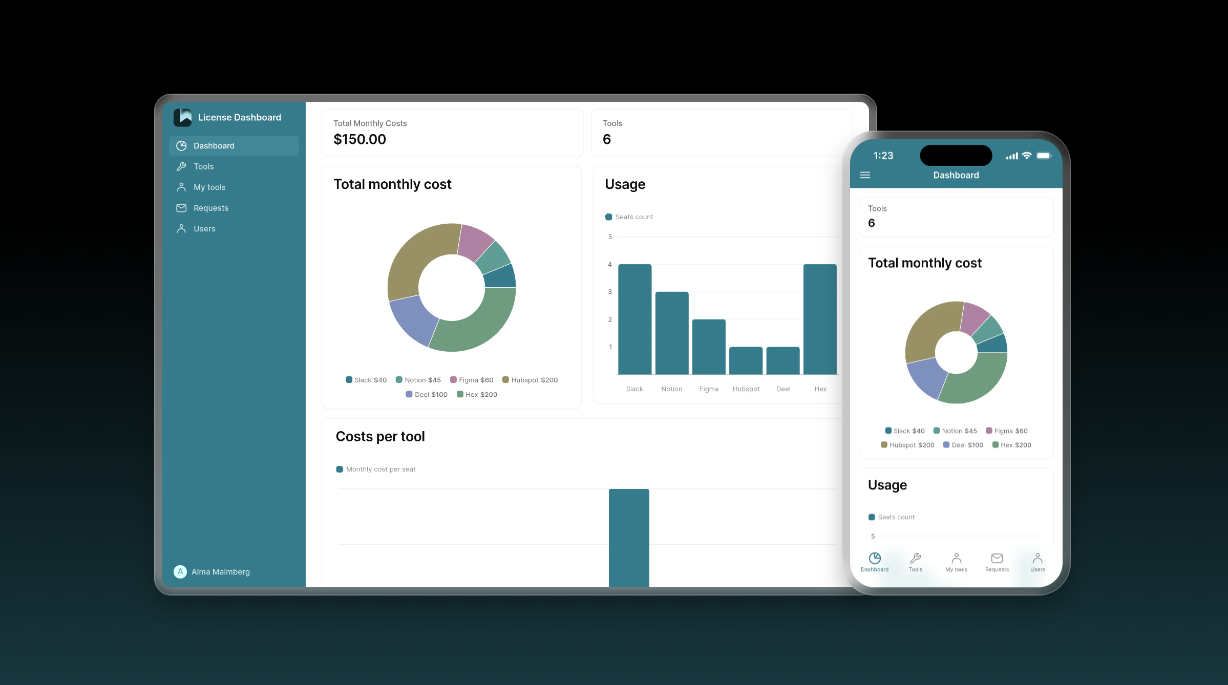
License Dashboard
The License Dashboard template helps you manage licenses and permissions for business tools. It will also help your IT team control access, monitor usage, and optimize software license spending.
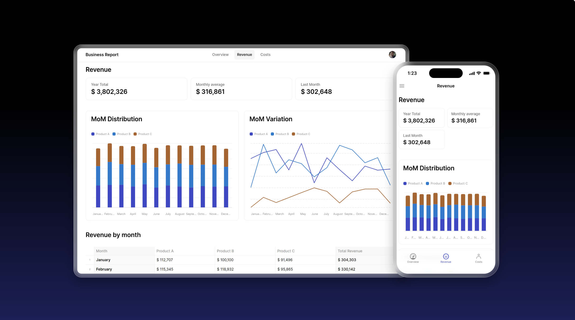
Business Stats Overview Dashboard
This Business Reporting template is a classic example of a dashboard. It uses our Big Numbers and Charts features to organize KPIs (key performance indicators) from a spreadsheet into an intuitive display full of graphs.
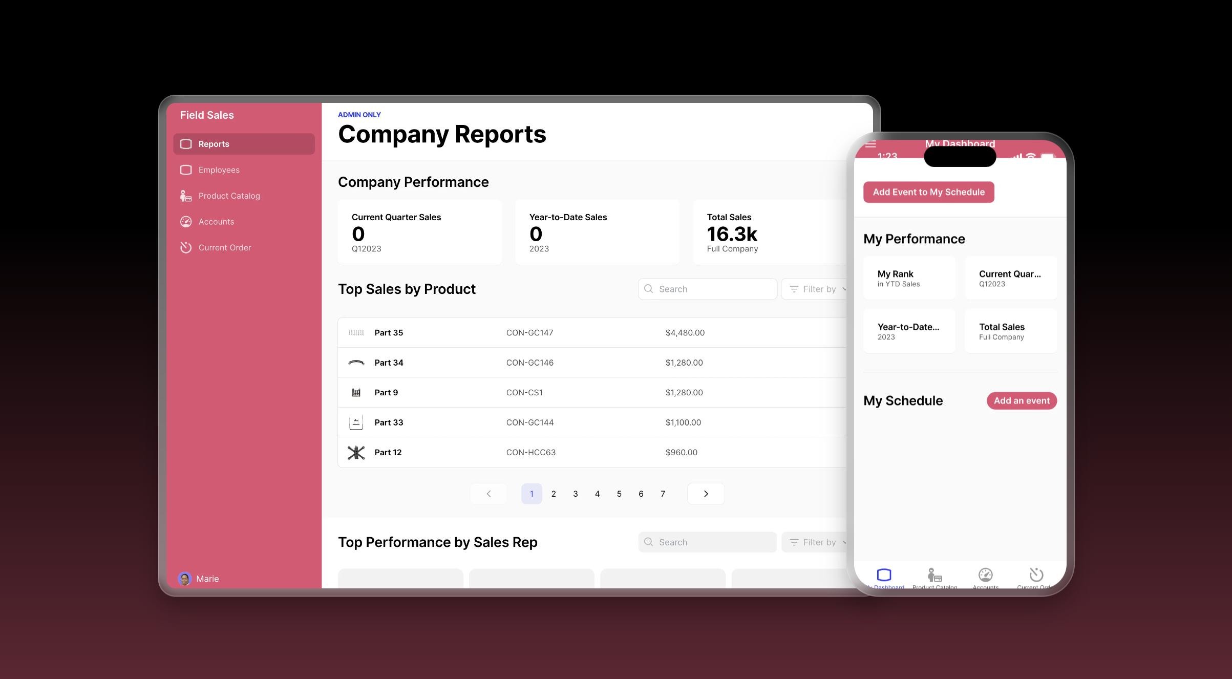
Field Sales Dashboard
Finally, check out the Field Sales Dashboard template, perfect for putting together a detailed dashboard for sales managers and personnel alike, especially if they are in the field trying to get quick data on a phone or tablet. Use it to manage sales and view up-to-date stats on company-wide performance, top-selling products, top-performing reps, and more.
Build your own tech stack to fit your exact specifications
Once you’ve got a dashboard up and running and a grasp of the power of no code, why stop at just a dashboard? The beauty of no code lies in its customizability. That means that you can use the same elements to configure a wide variety of apps for your business. If you need a CRM or a customer portal, it’s easy to build one that is fully customized to your needs. With one platform comes many solutions.
The best part is that all these tools can share data, share users, and share admins, making it easy to build all the tools you need. Whether you enlist the help of an Expert or get right into building yourself, these tools will be better for your business because they will be built for your business.
Get started with Gide today.


